Hi! I'm Renata — a curious mind who turned spreadsheets into dashboards and questions into models.
With over 15 years of experience connecting data with real business decisions,
I started my journey in the Tax domain, where I created performance dashboards, trained teams,
and simplified workflows through automation — even before I knew what ETL was!
When I became a mother, I decided to reinvent myself. I moved into tech and fell in love with programming, data storytelling, and Machine Learning.
Today, I bring together my business background, analytical mindset, and developer skills to create real impact.
Whether building dashboards or predictive models, my goal is the same: make data clear, human, and powerful.
I'm looking for a position as a Data Analyst, a Junior Data Scientist or a Python Developer
A little about myself.
e-mail: recalesi@yahoo.com.br
Country: Brazil
City: Sao Paulo
A little more about me: I'm married and have two daughters.
Hobby: I play piano
“I am a tenacious and lifelong learner, fueled by enthusiasm to collaborate with the company and drive toward achieving exceptional results.”
Portfolio
Welcome to my portfolio — a collection of data-driven projects that demonstrate my ability to transform complex problems into actionable insights through Python, Power BI, and Microsoft Fabric.
These projects span Machine Learning modeling, regression analysis, time management optimization, clustering with PySpark, and advanced data storytelling — all built with libraries such as pandas, numpy, matplotlib, seaborn, scikit-learn, and skmultilearn.
Each initiative reflects not only technical skill, but also a real-world focus and business context.
I’d like to thank Data Science Academy for their guidance and inspiration throughout my learning journey.
If you’re curious to explore dashboards, notebooks or code, you’ll find the links to my GitHub and project pages below. Enjoy the data-driven dive!
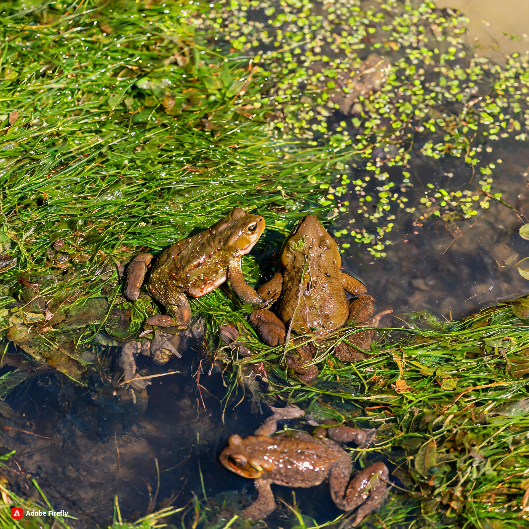
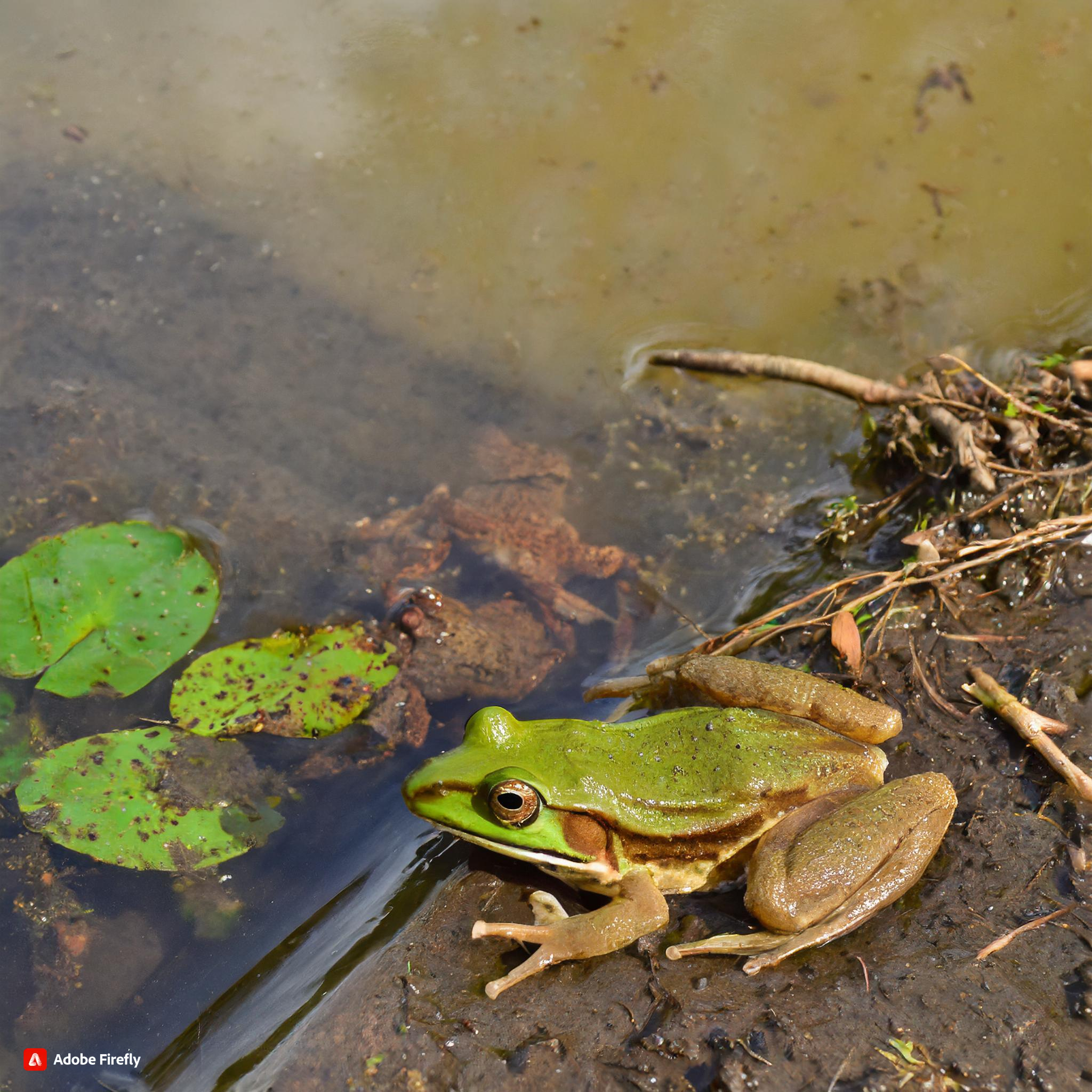
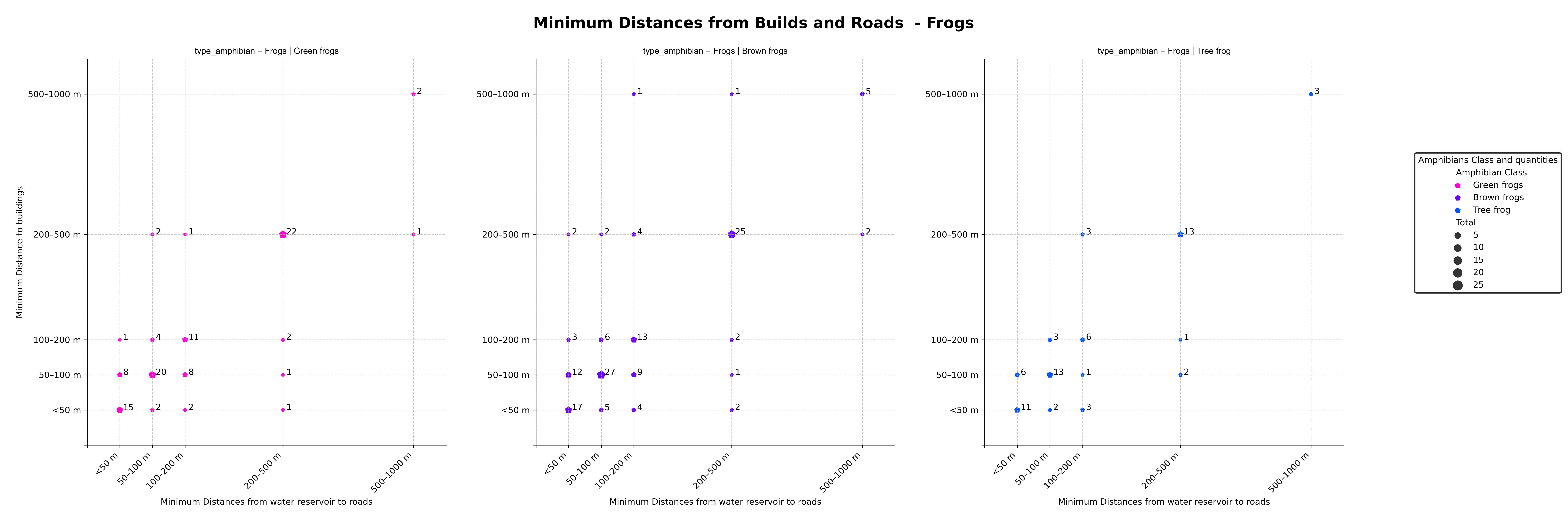
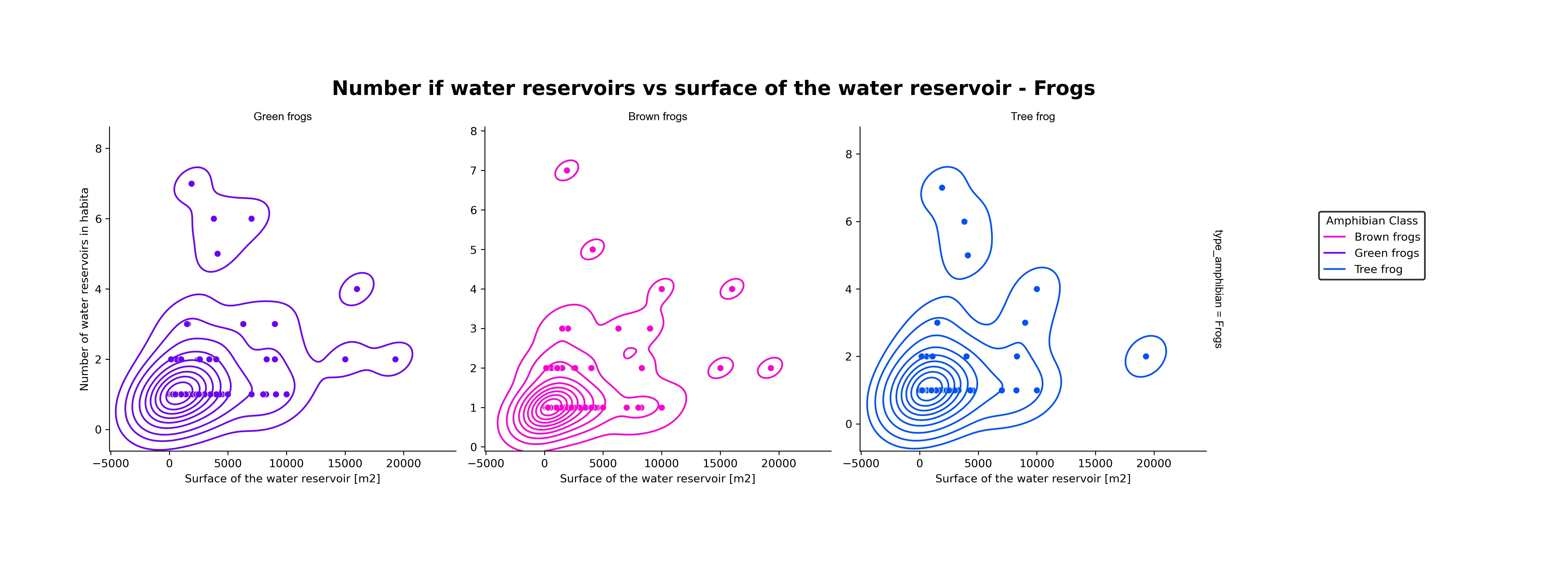
This project aims to identify the presence of amphibians in the vicinity of two road construction sites in Poland. Our objective is to predict the presence of various types of amphibians near these construction sites and assess the environmental impact on these animals.
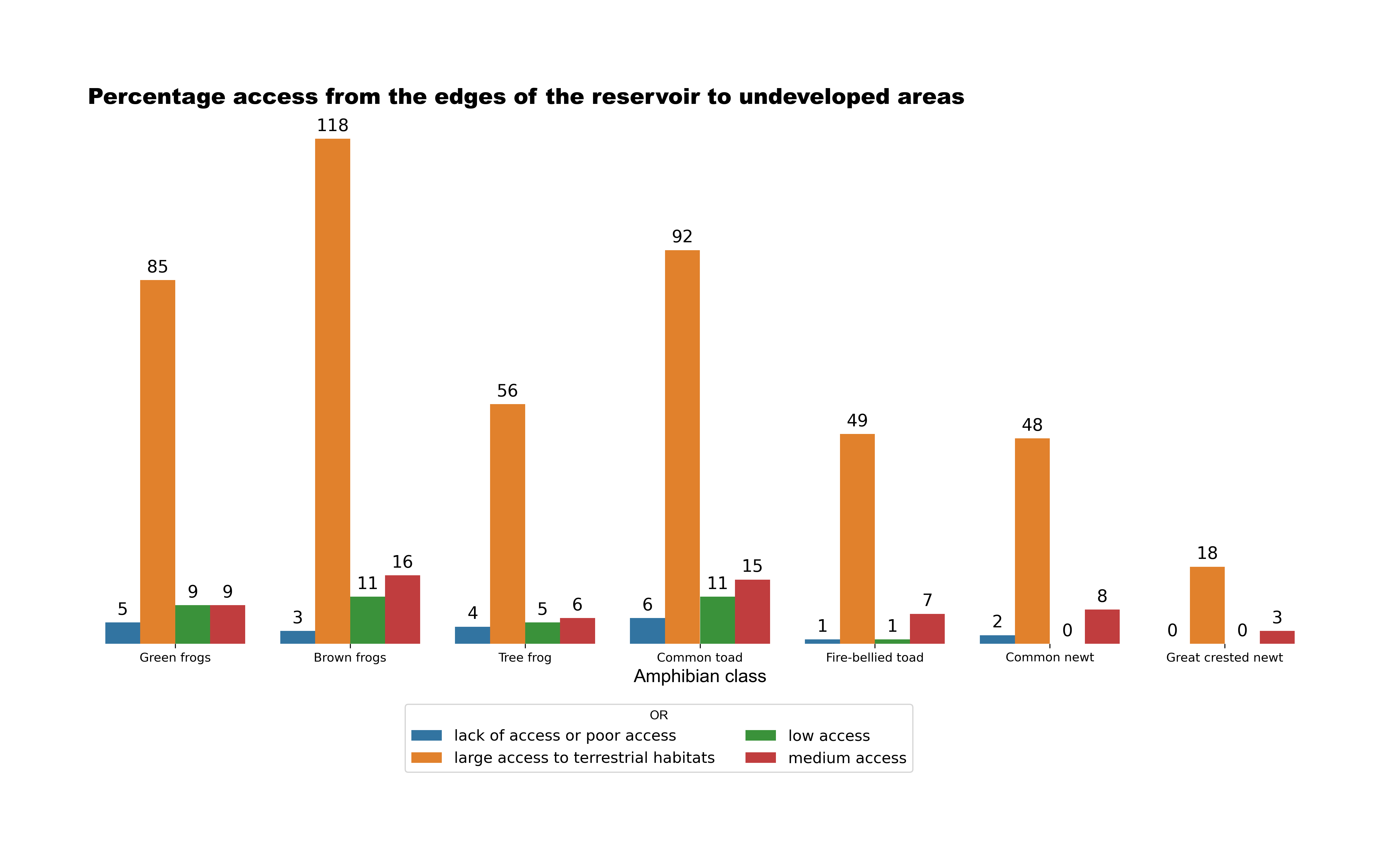
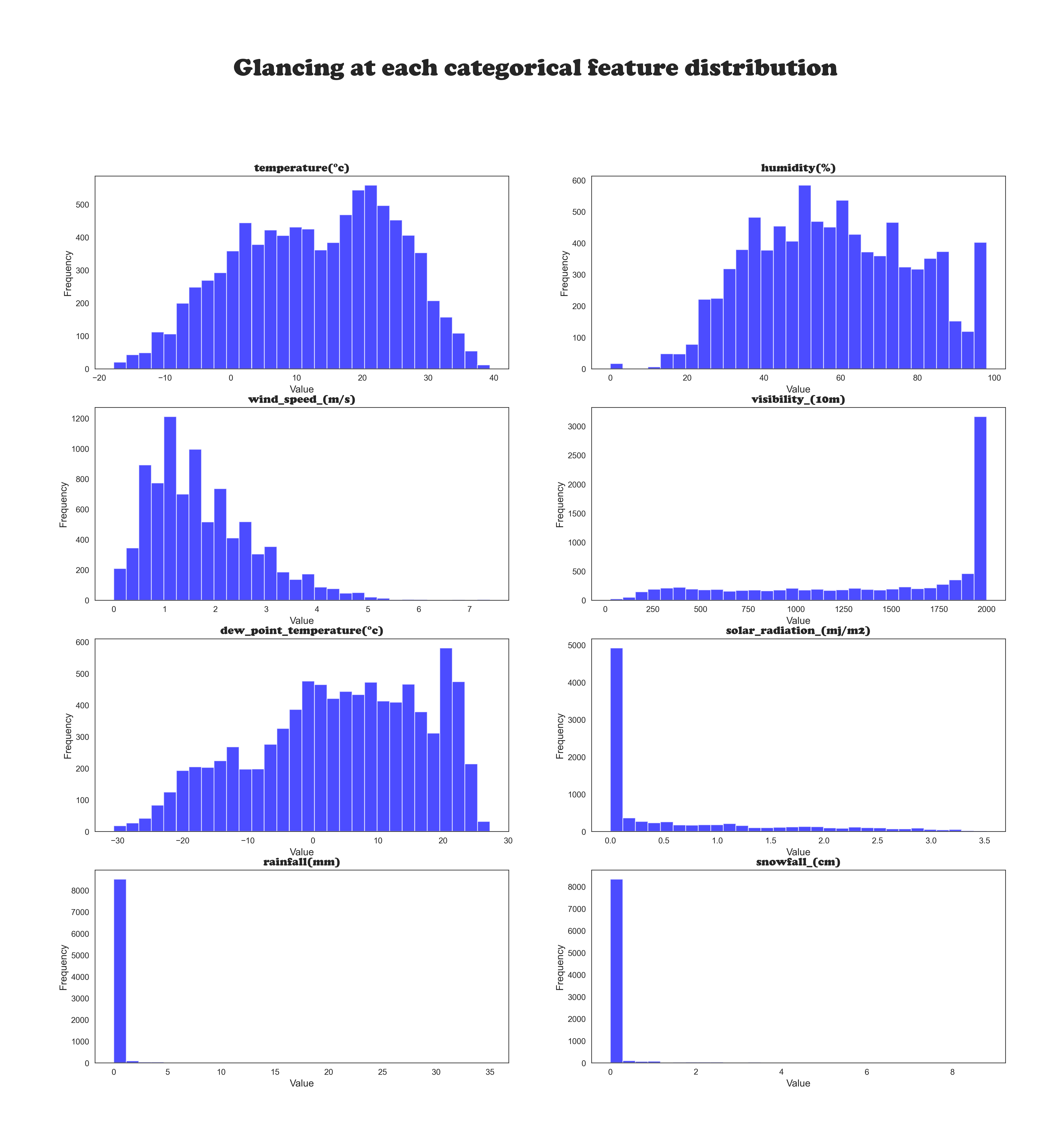
The dataset provided by the UC Irvine Machine Learning Repository includes information on buildings, reservoirs, urban or rural areas, reservoir surface characteristics, water reservoir types, the number of reservoirs, minimum distances from buildings and roads, reservoir maintenance status, and shore types.
One of the initial challenges was understanding the different types of amphibians provided in the dataset. As I lack expertise in amphibians, I had to familiarize myself with the fact that the dataset doesn't just include frogs but also various types of frogs, newts, and toads. Additionally, it was important to recognize that each species prefers a specific type of environment.
Another challenge was comprehending the information in the dataset and understanding the meaning of each feature. Upon closer examination, it was surprising to find discrepancies between the expected values and the actual values provided. For instance, for the variable "TR," we expected values ranging from 'a' to 'j' or from 1 to 10. However, the dataset included different numeric categories such as ‘1’, ‘5’, ‘12’, ‘14’, ‘15’, ‘11’, ‘2’, and ‘7’ for the TR feature, with no accompanying information regarding their meanings. These numbers likely represent internal codes used by the authors of the dataset to denote water types, but without a clear key, it was challenging to interpret their significance. This lack of clarity hindered our ability to explore certain features in more detail.
Such preliminary analysis is crucial before constructing a model.
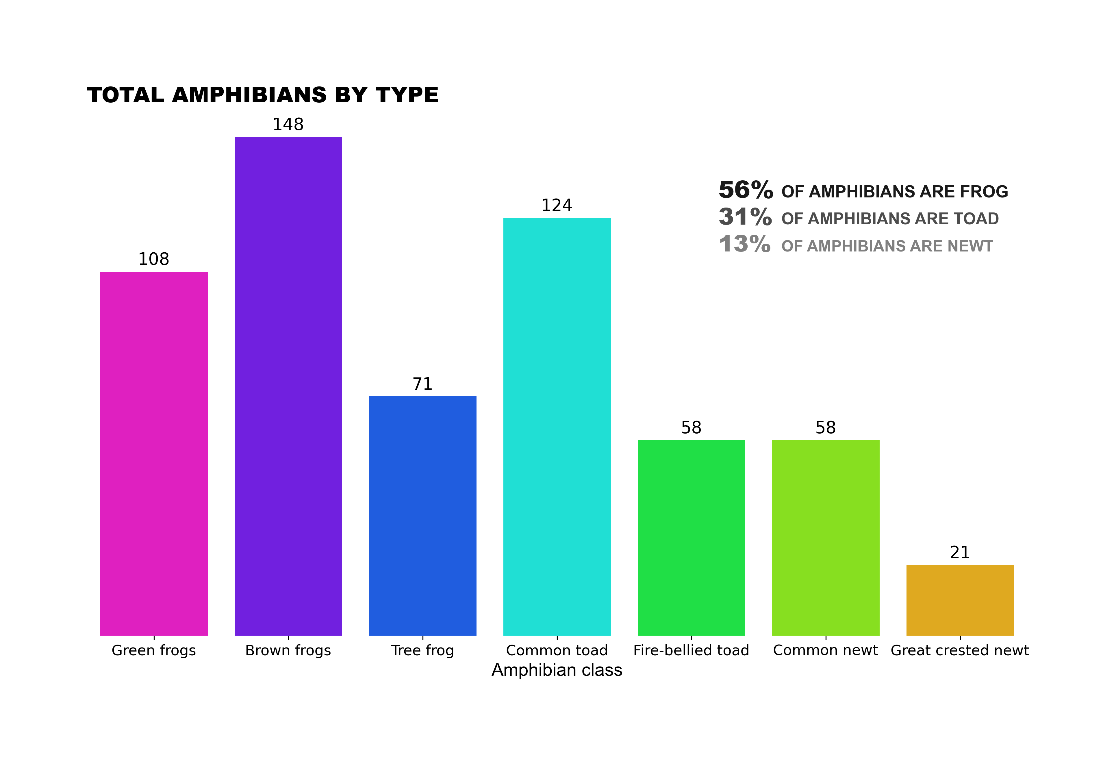
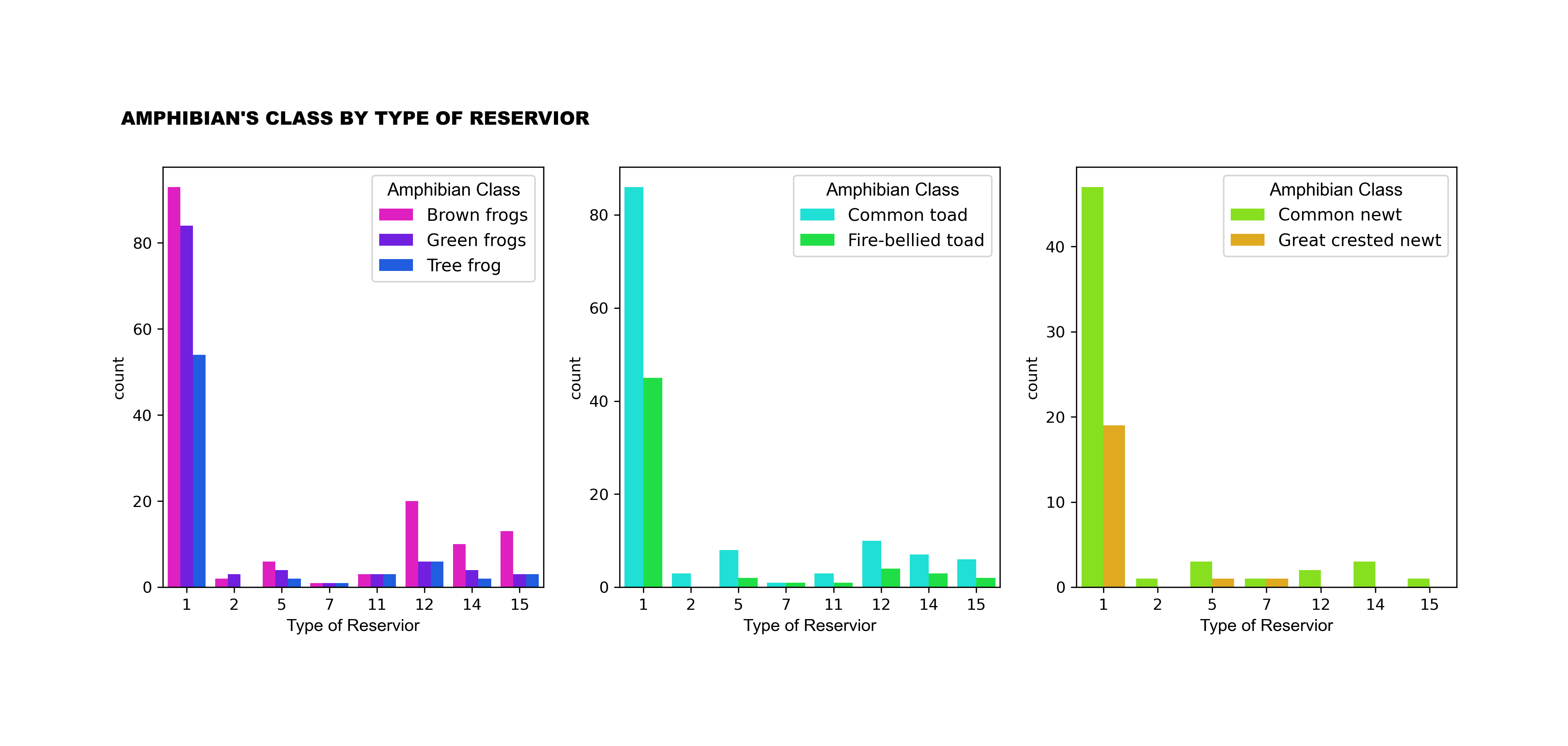
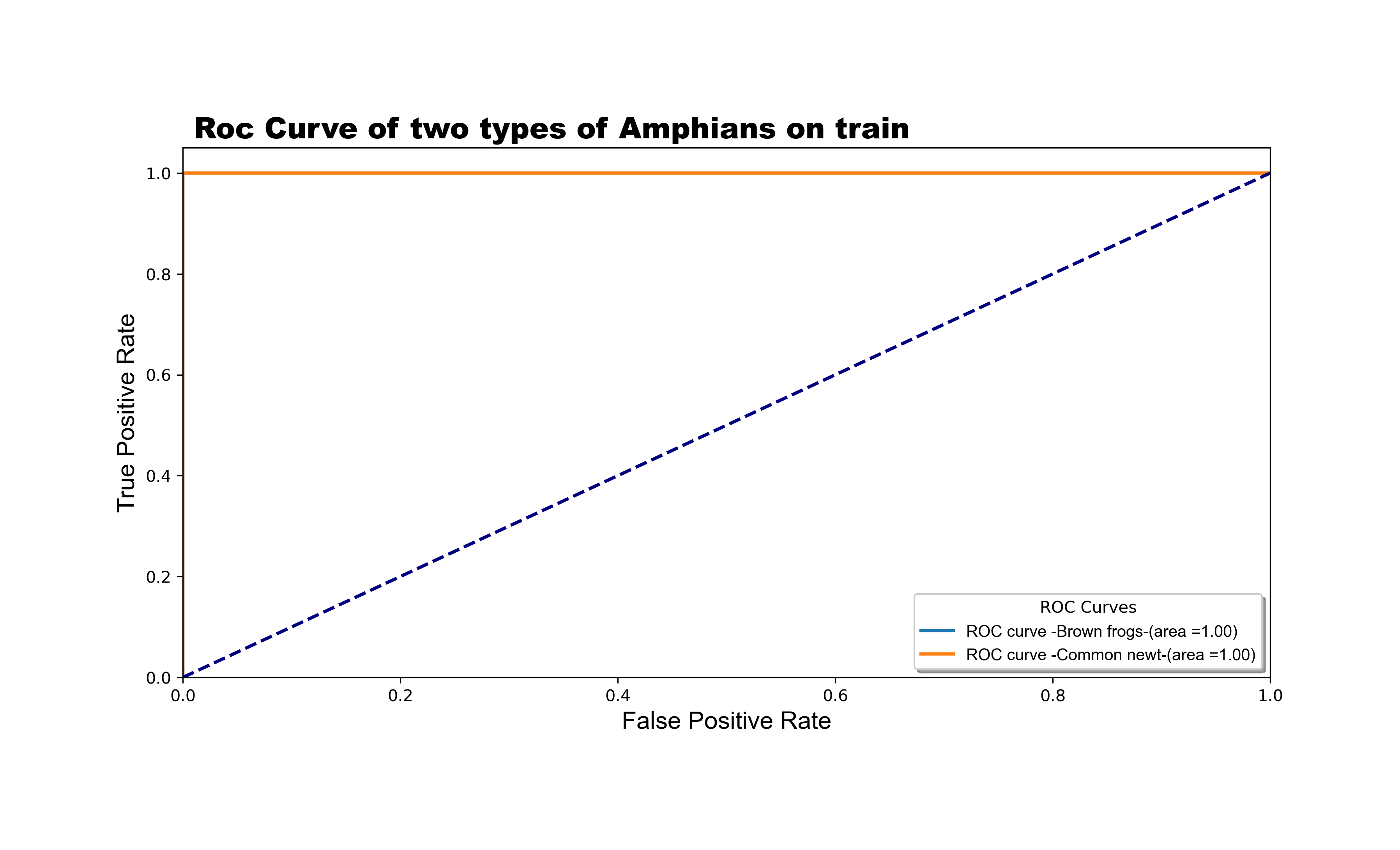
The bar chart provides information about the number of amphibians divided into species indicators during the construction of roads (Road A and Road B) in Poland. Overall, frogs are the most representative amphibians, followed by toads, while the newt is the least representative species indicator.
Among frogs, the most common type is the brown frog, with 148 species, representing 45% of all frogs. Additionally, green frogs account for 108, and the remaining three frogs contribute 71, totaling 54% of the frog population.
Regarding toads, there are 124 units, making it the second-highest number on the chart. Interestingly, the fire-bellied toad has the same unit count as the common newt, both with 58 units. The least representative figure is the Great Crested newt, with only 21 units
Methodology
In our feature engineering process, we performed numerical and categorical transformations and created new features and classifications to aid in the analysis of amphibian types.
Before constructing our model, we visualized relationships and constructed charts to better understand the data.
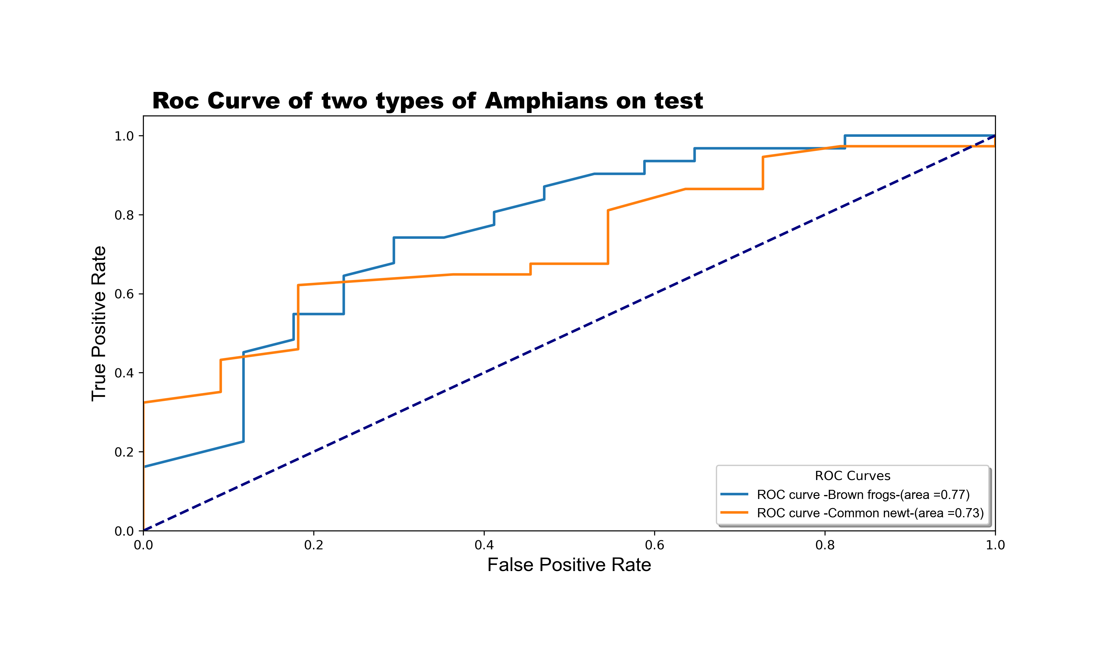
For this project, we utilized the Binary Relevance scheme with a Random Forest model, assuming that all class labels are independent of each other. We employed pandas for data manipulation, matplotlib and seaborn for data visualization, and sklearn for preprocessing the data using MultiLabelBinarizer. Additionally, we built a model using skmultilearn’s Binary Relevance technique with a Random Forest model. Our workflow involved understanding the data, exploring variable categories, transforming variables, and optimizing memory usage. We addressed missing values and unique value considerations, converting categorical types to binary representations.
Analysis and Results
The model achieved a Total Hamming Loss of 0.25 and an F1 Score of 0.69. This result is satisfactory, especially when compared to other schemes such as Label Powerset and Classifier Chain, which achieved 29.76% and 27.38% respectively. Our ROC curve indicates good coverage, with values close to 1.
Thus, the Random Forest with Binary Relevance Scheme demonstrated superior performance for our classification problem.
Lessons Learned
This project marked my first experience with multilabel classification. As a result, I now feel more comfortable tackling other multilabel classification problems. I am confident that this project has significantly contributed to my knowledge in this area.
You can see details about this project on my page on the Medium site.Clique aqui
Project information
Category: Machine Learning MultiLabel Classification Problem
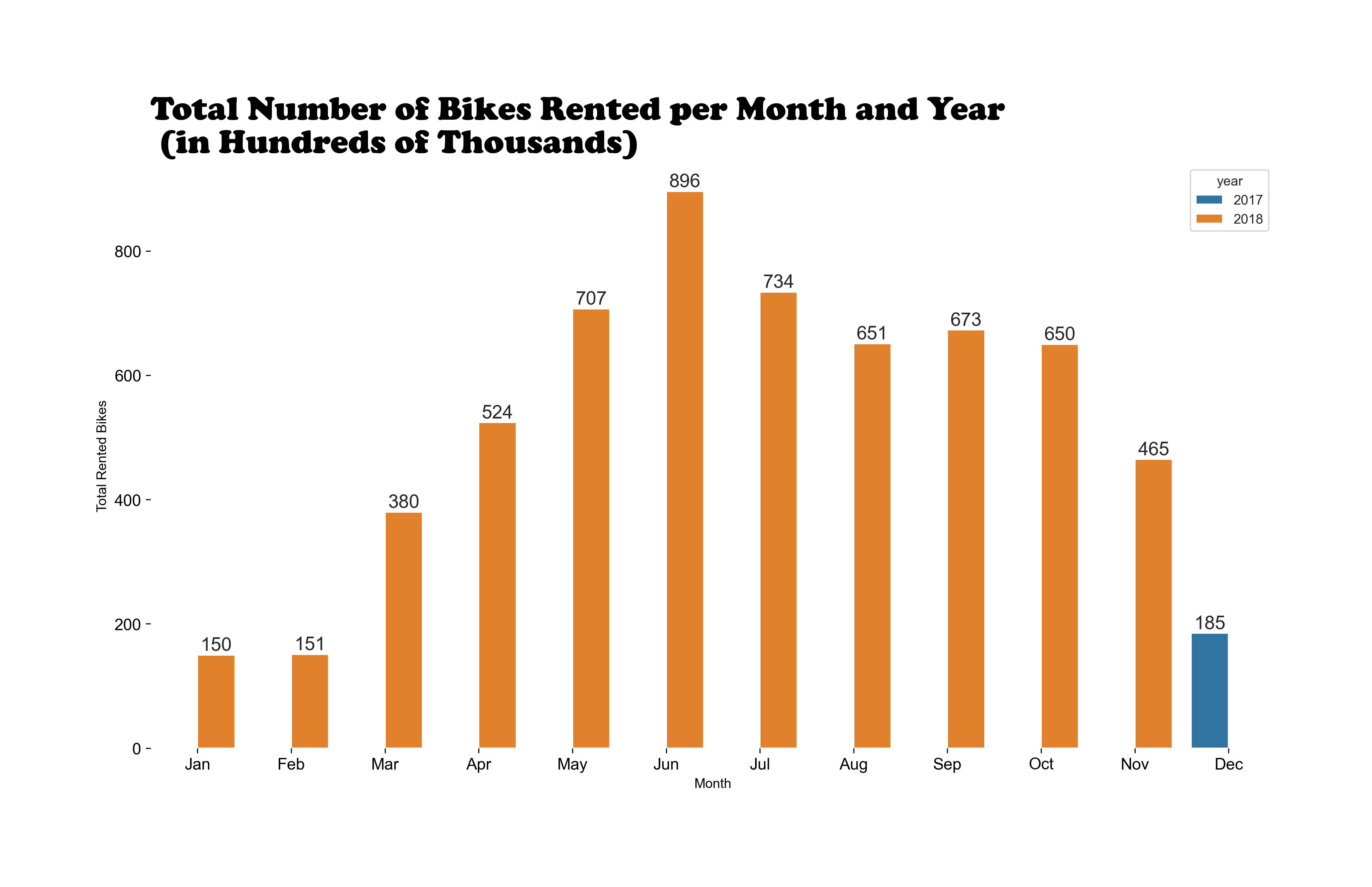
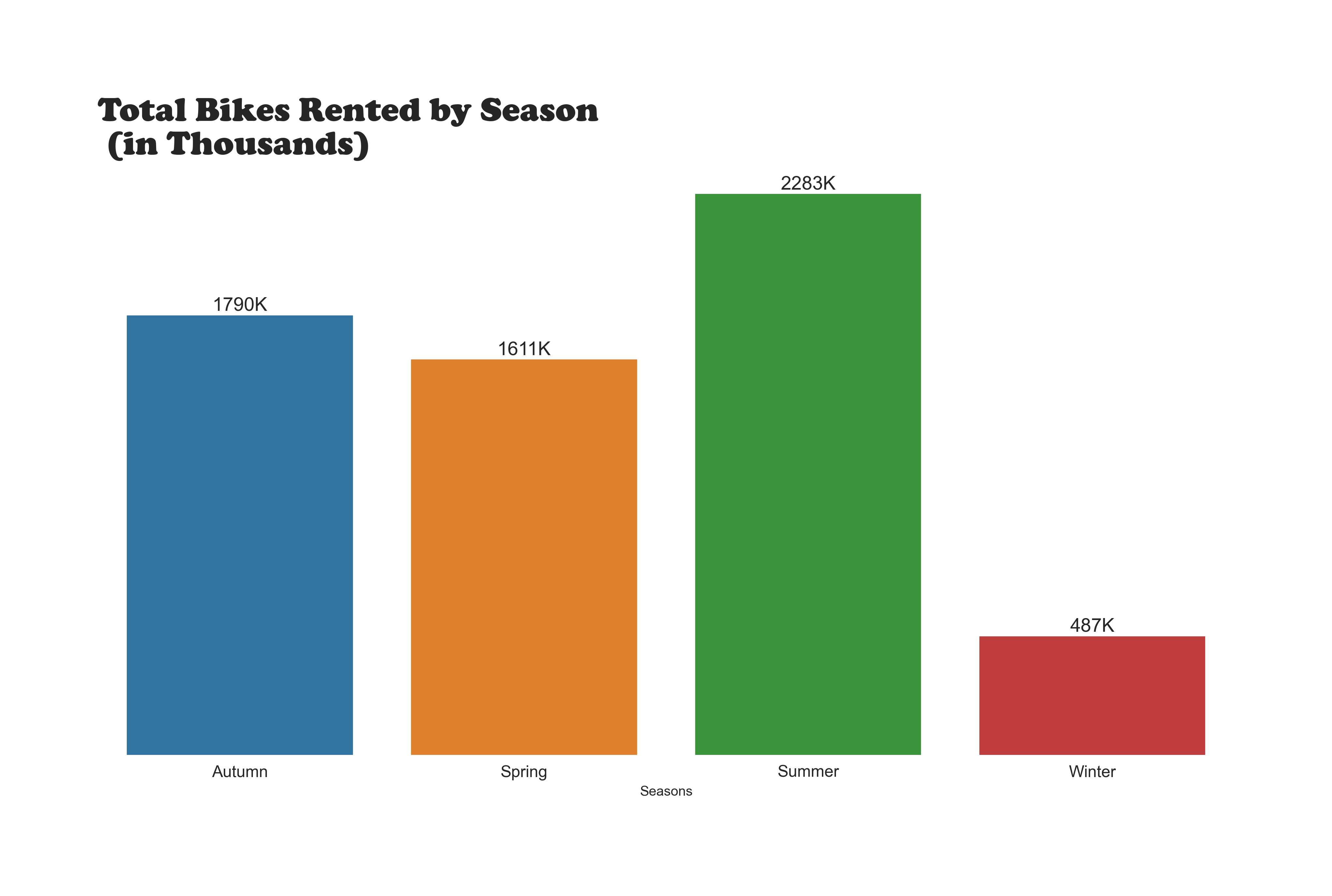
Case Study Rental Bikes in Seoul a Linear Regression
Introduction
Bike-sharing systems have become an essential part of urban transportation. Accurate predictions of bike rental demand can help optimize fleet management,
improve user experience, and ensure a stable supply of rental bikes.
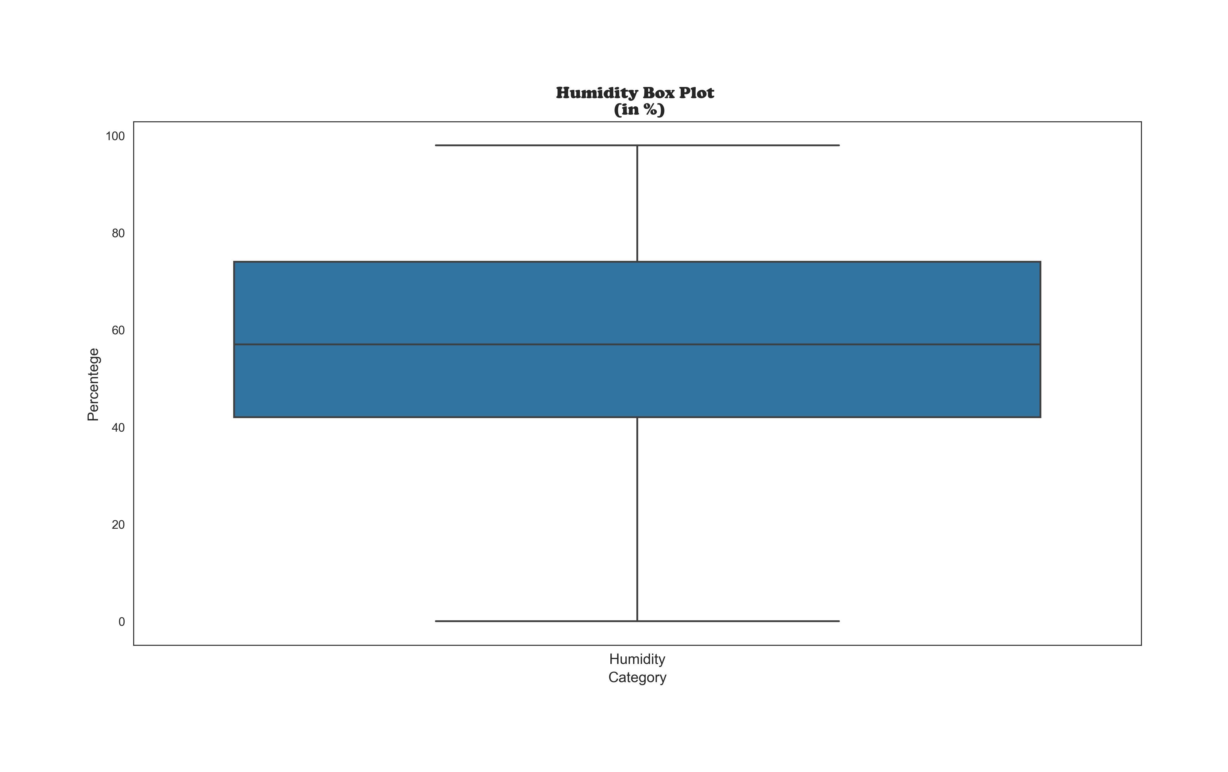
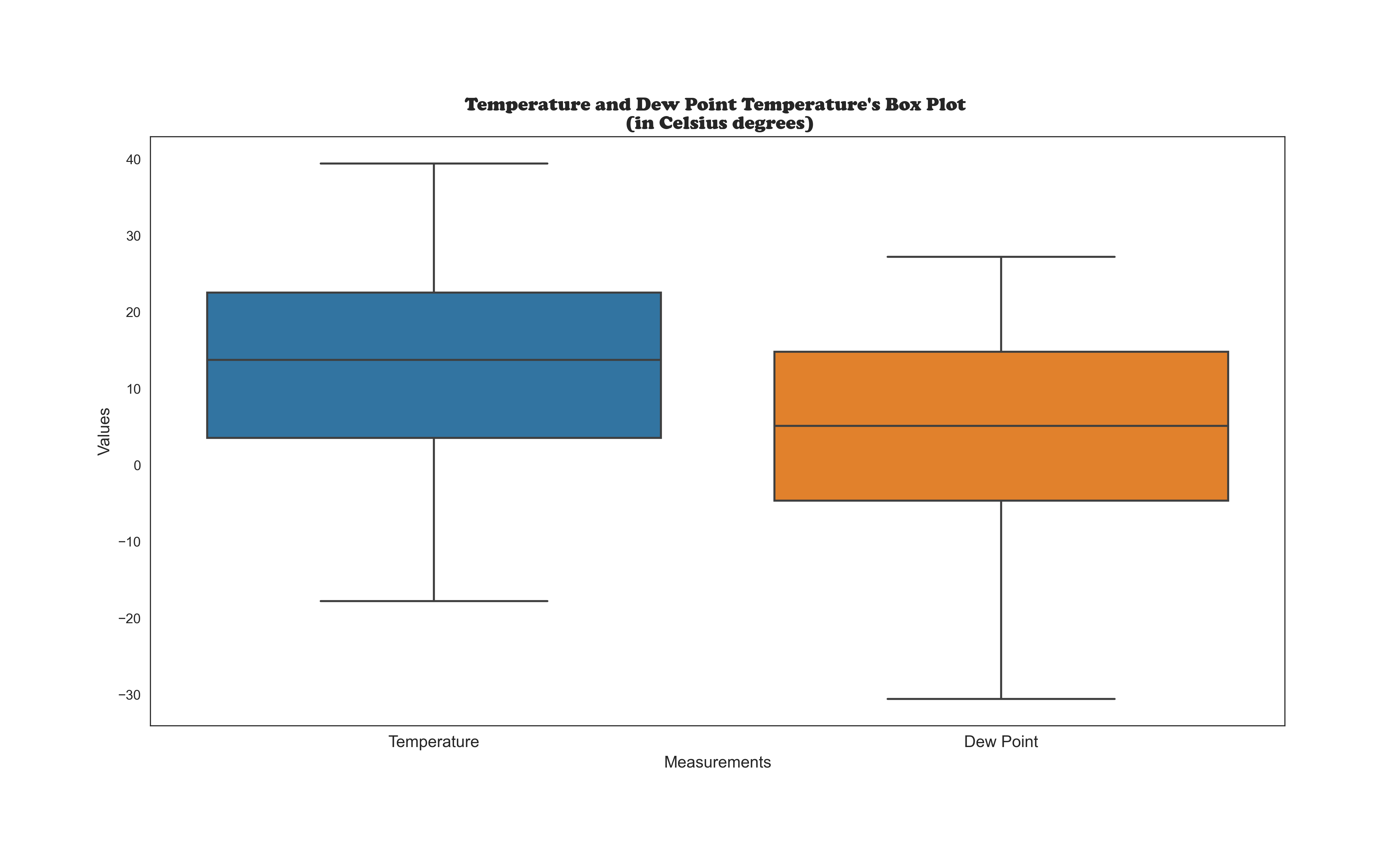
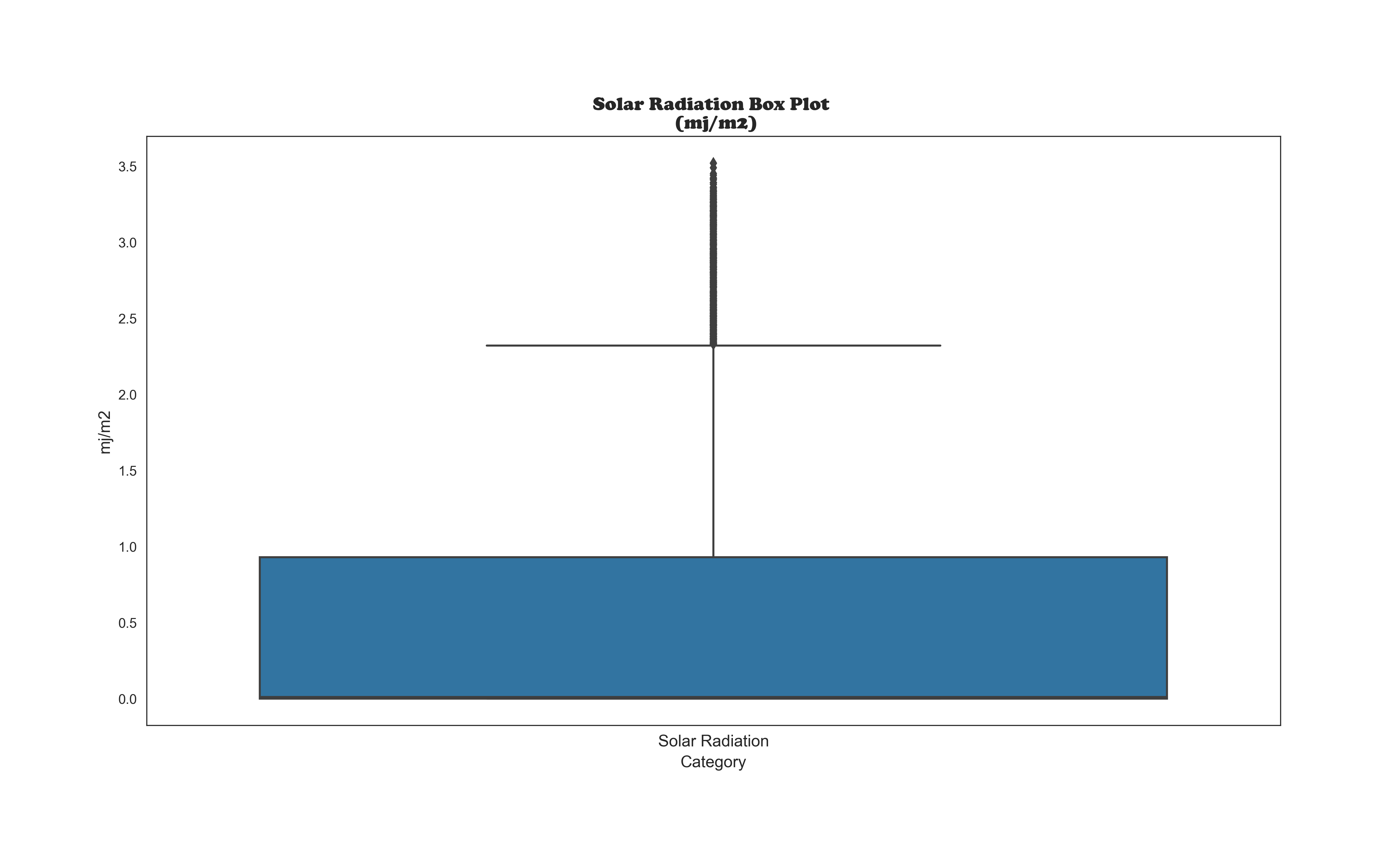
Our dataset comprises hourly records, including weather data (temperature, humidity, etc.)
and the total number of bikes rented. Each observation represents a specific hour of the day.
Our goal is to build a predictive model that accurately estimates the bike rental count for each hour based on various factors.
This project is not finished yet. What you will see on my GitHub page is a work-in-progress.
font:https://10mag.com/seoul-bike-rental/
Data analyzed with Power BI
Data analyzed with Matplotlib and Seaborn
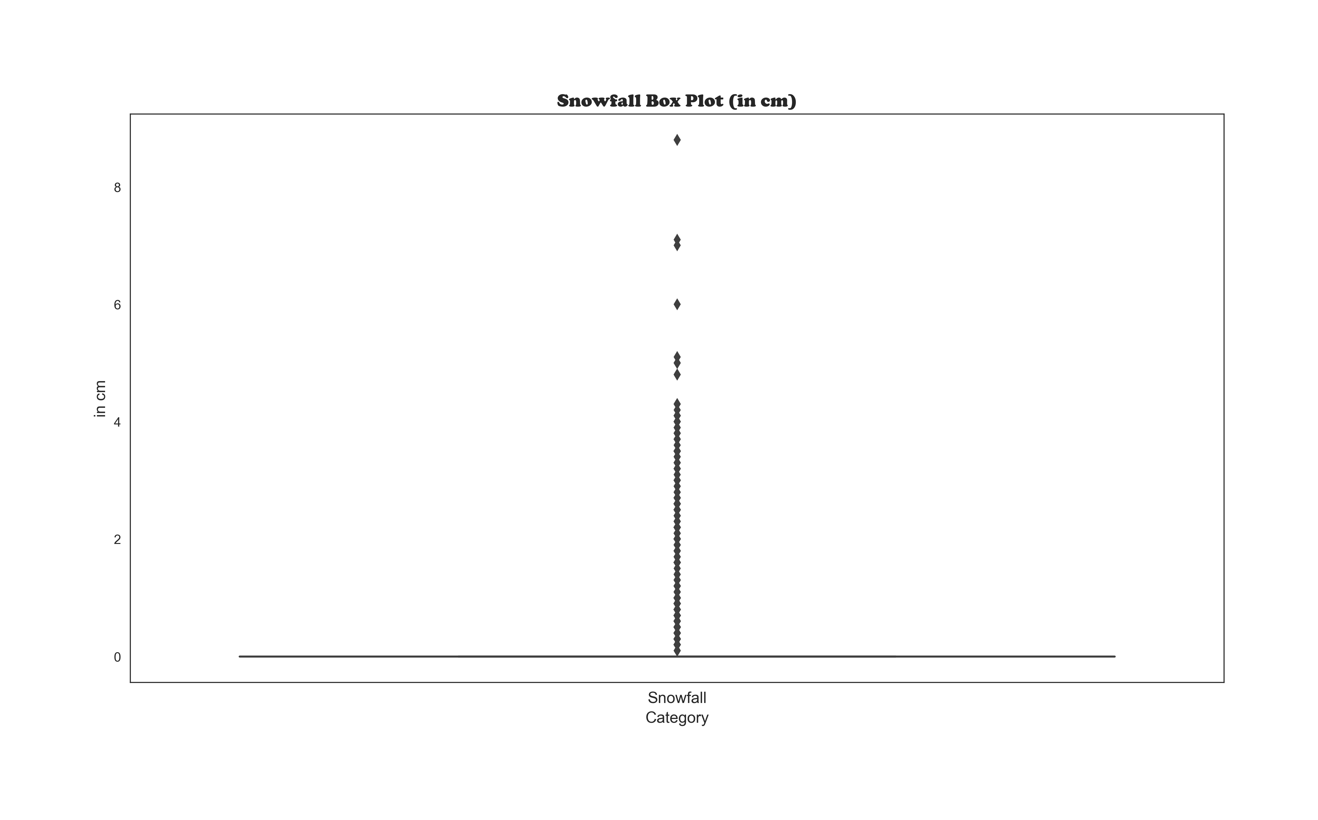
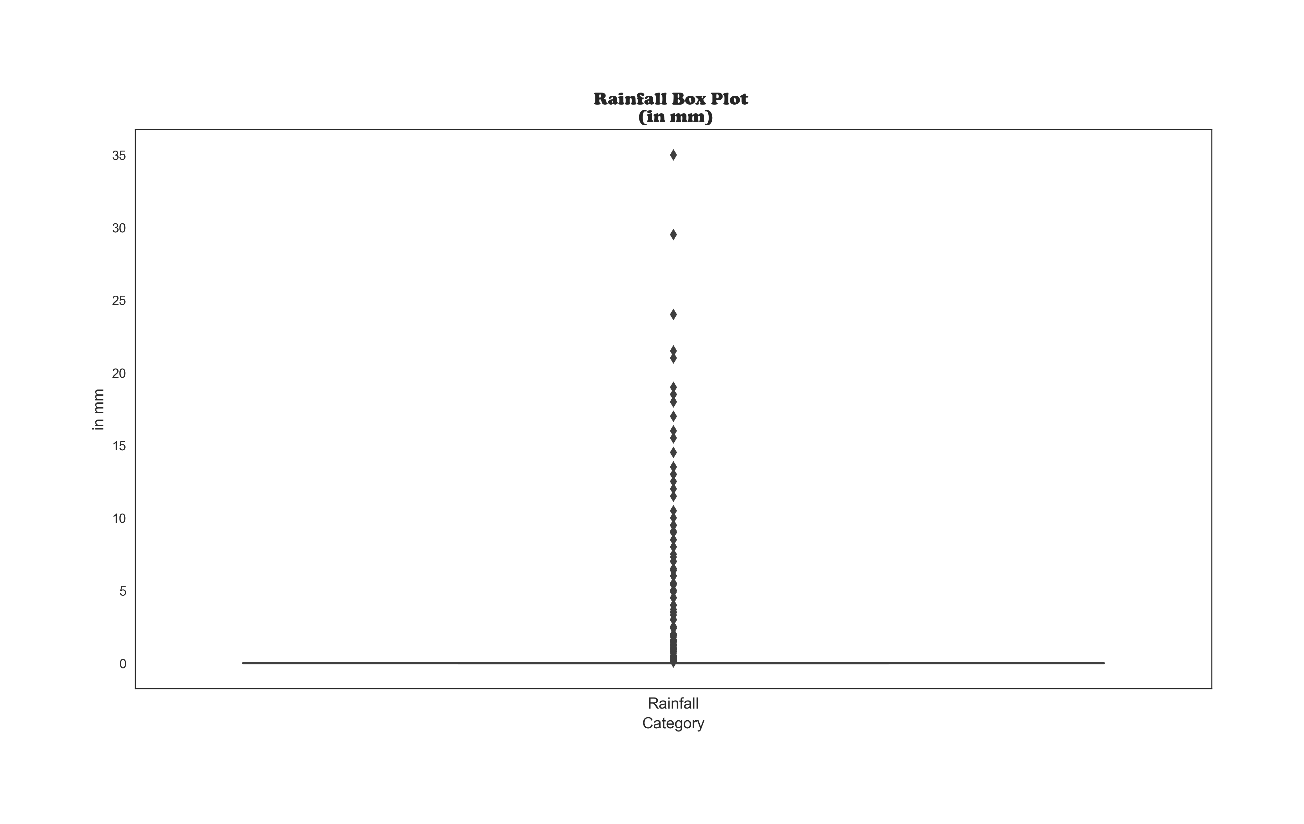
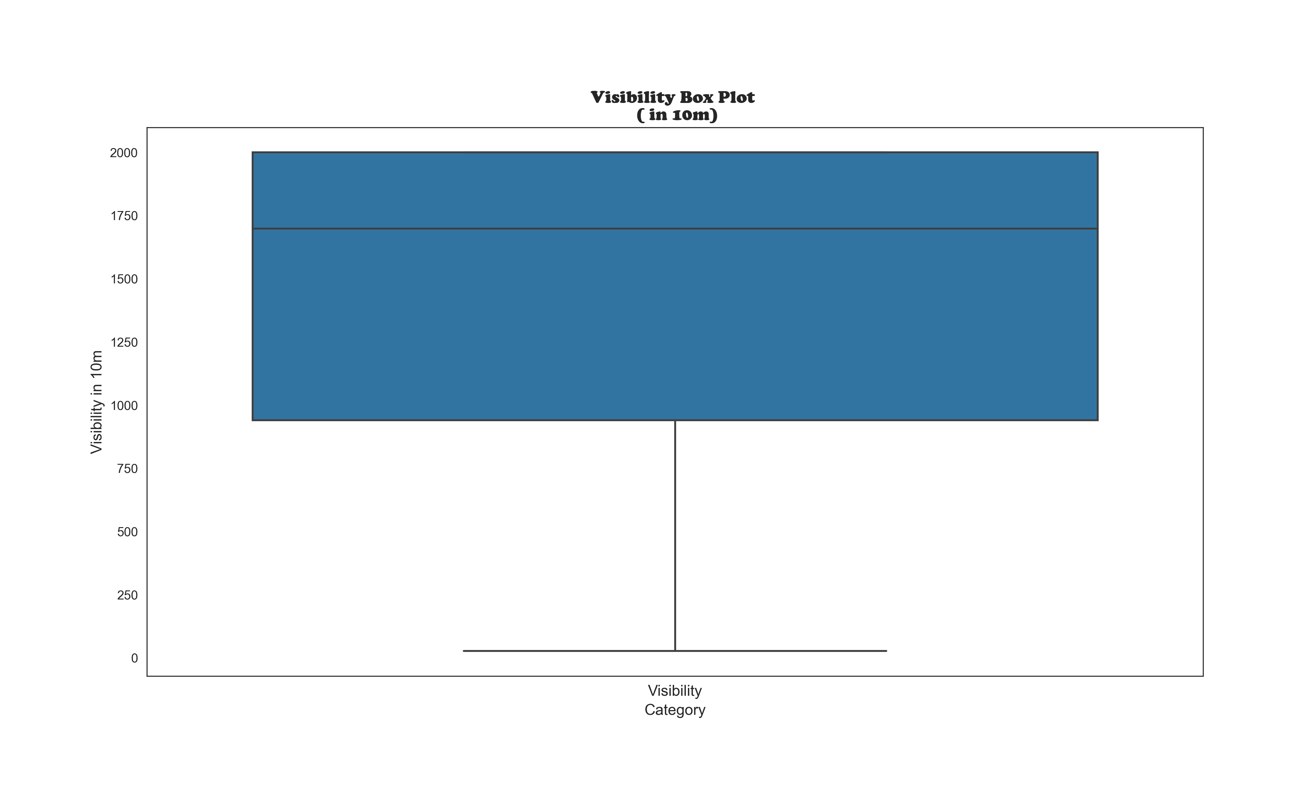
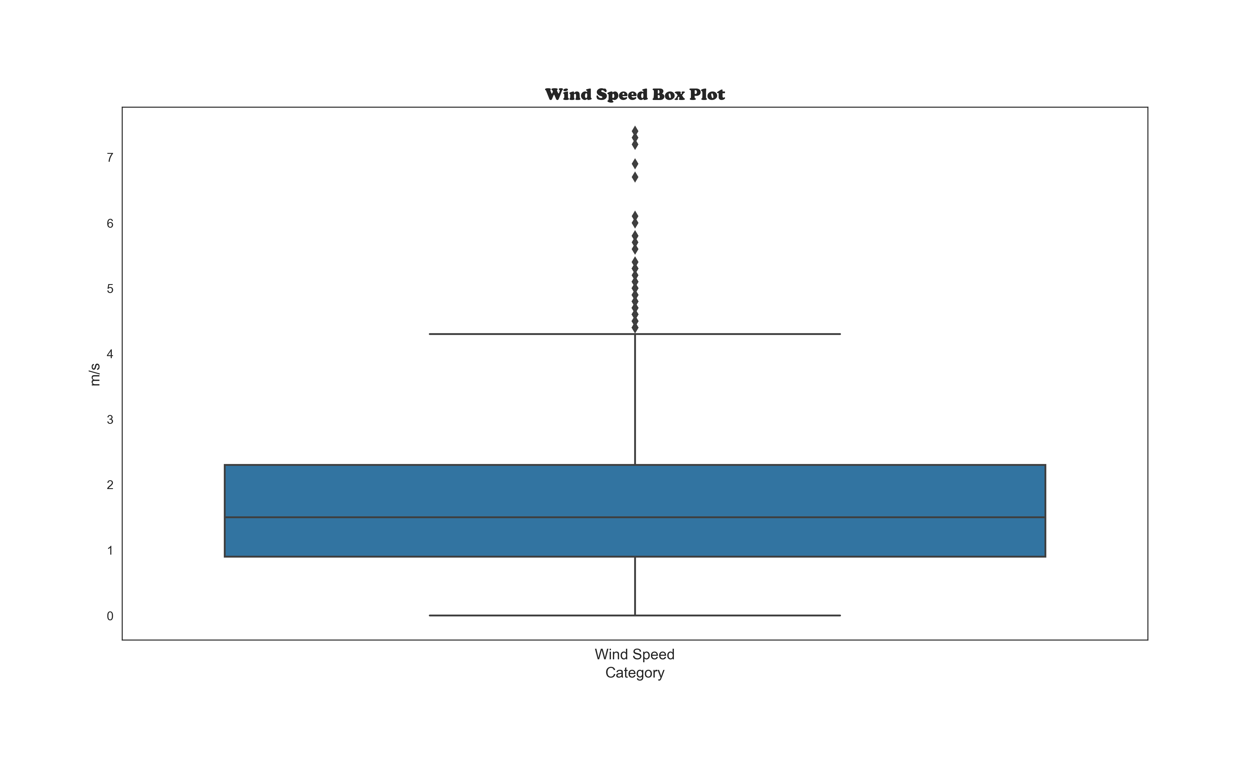
Looking for Outliers
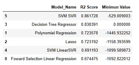
The Machine Learning' Models Plots
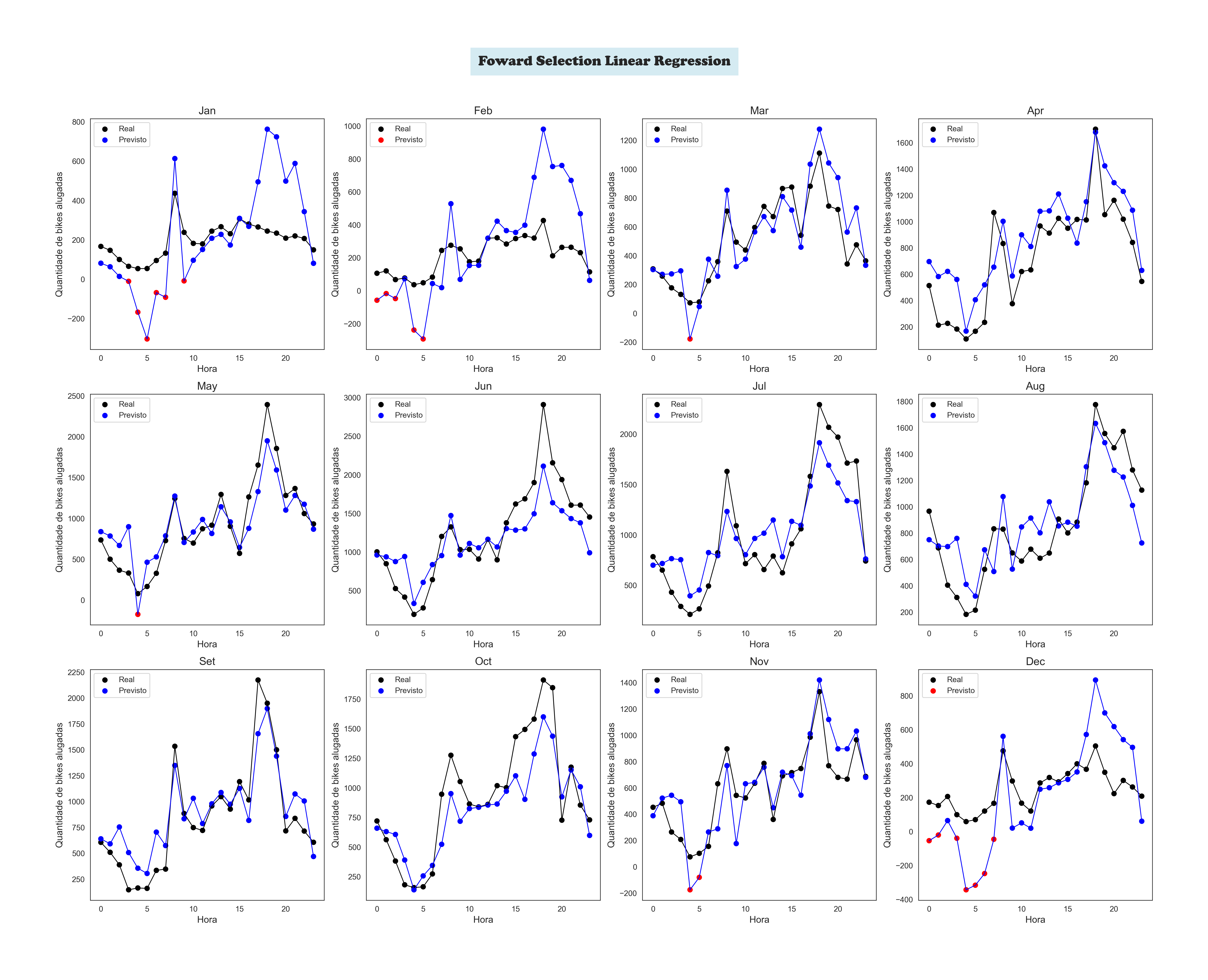
A Forward Linear Regression Plot by Month
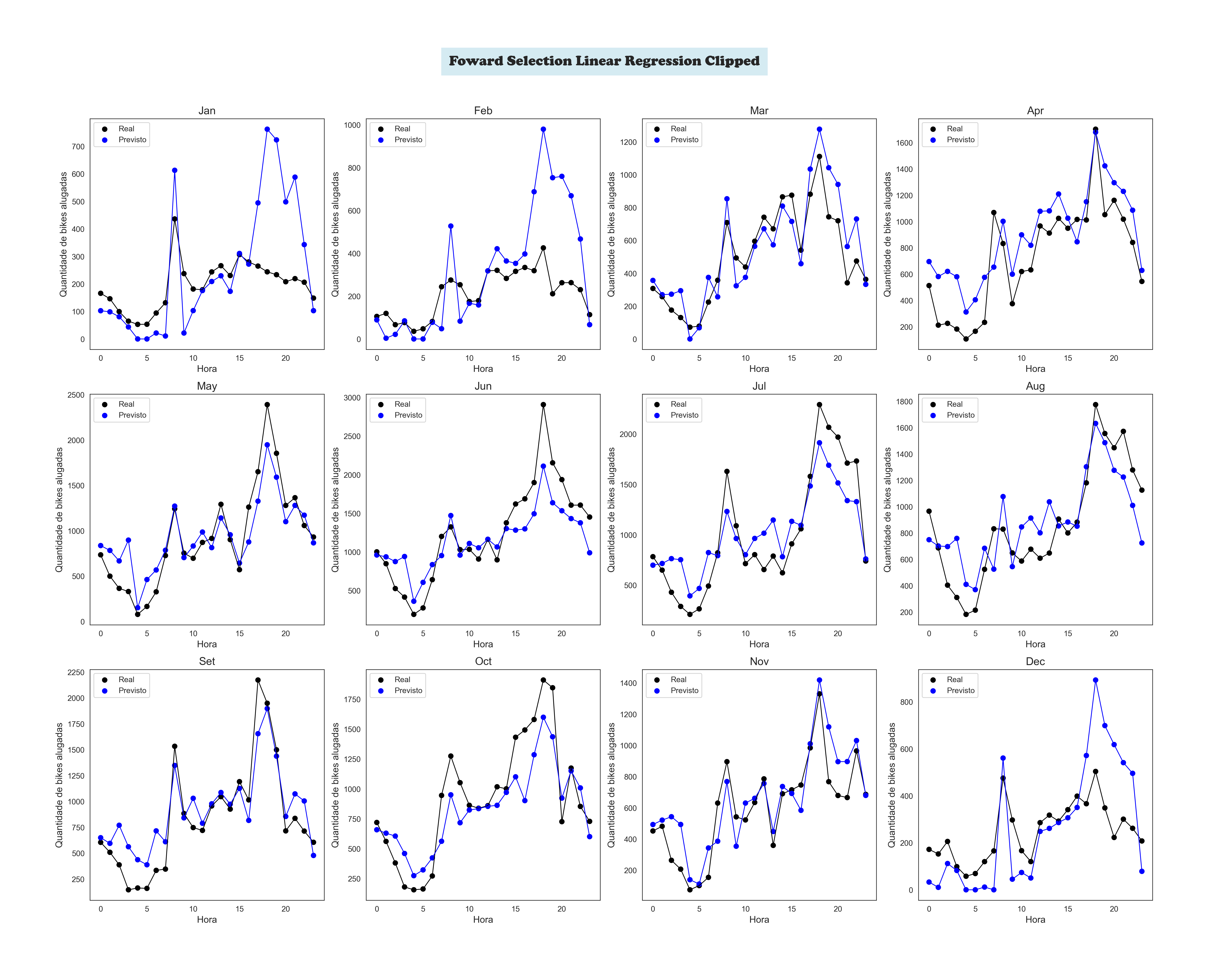
Foward Selection Linear Regression Clipped by Month
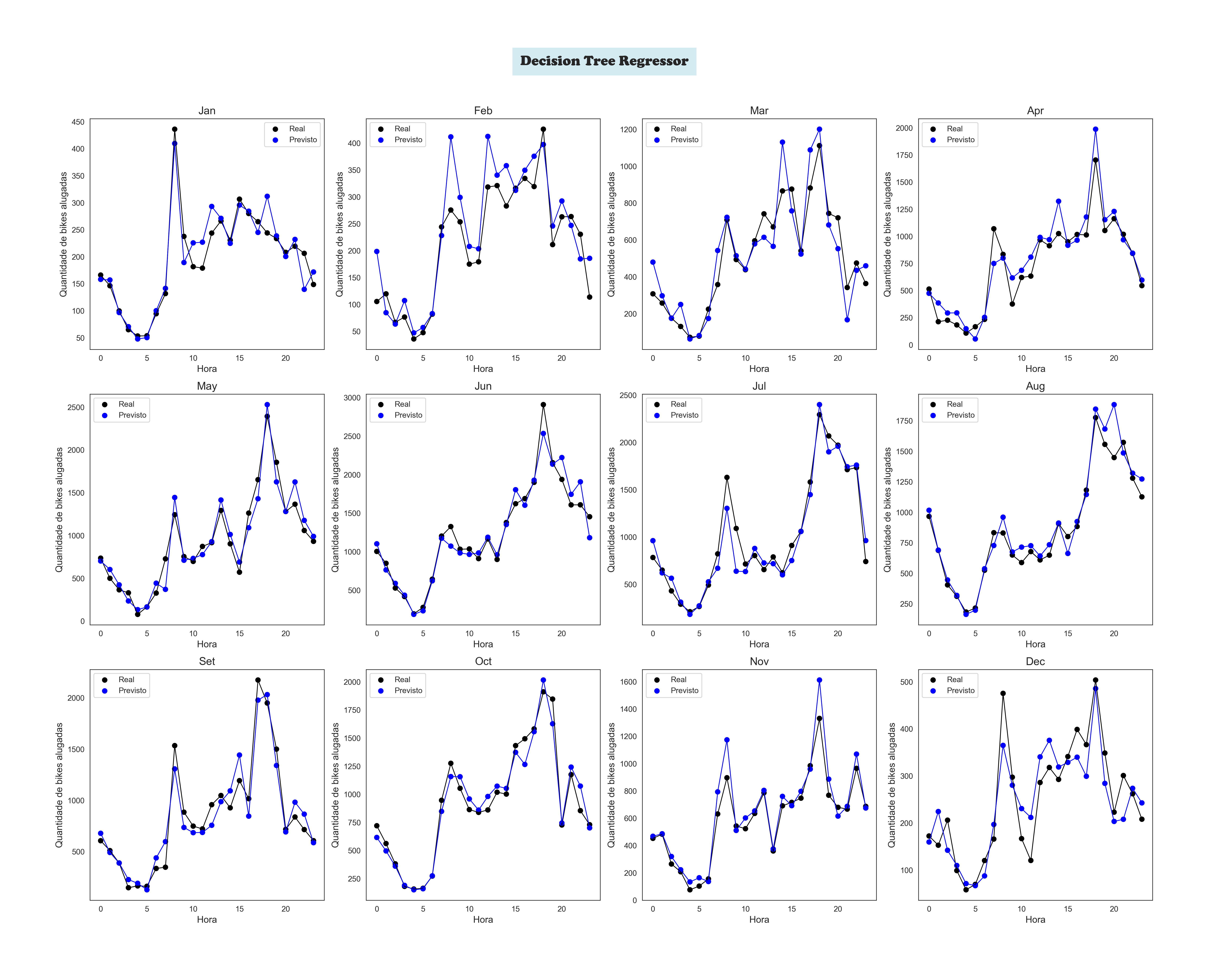
Decision Tree Regressor by Month
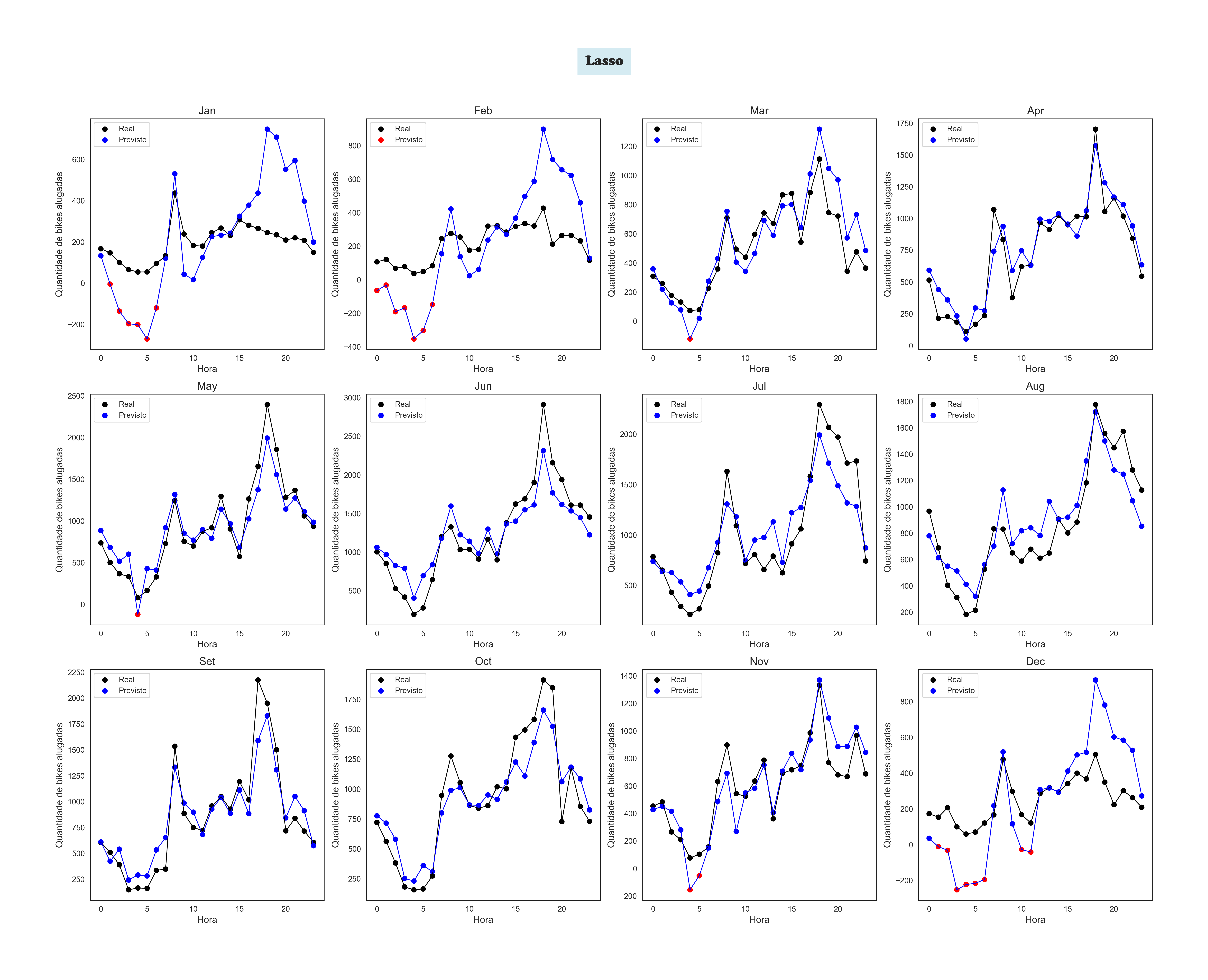
Lasso by Month
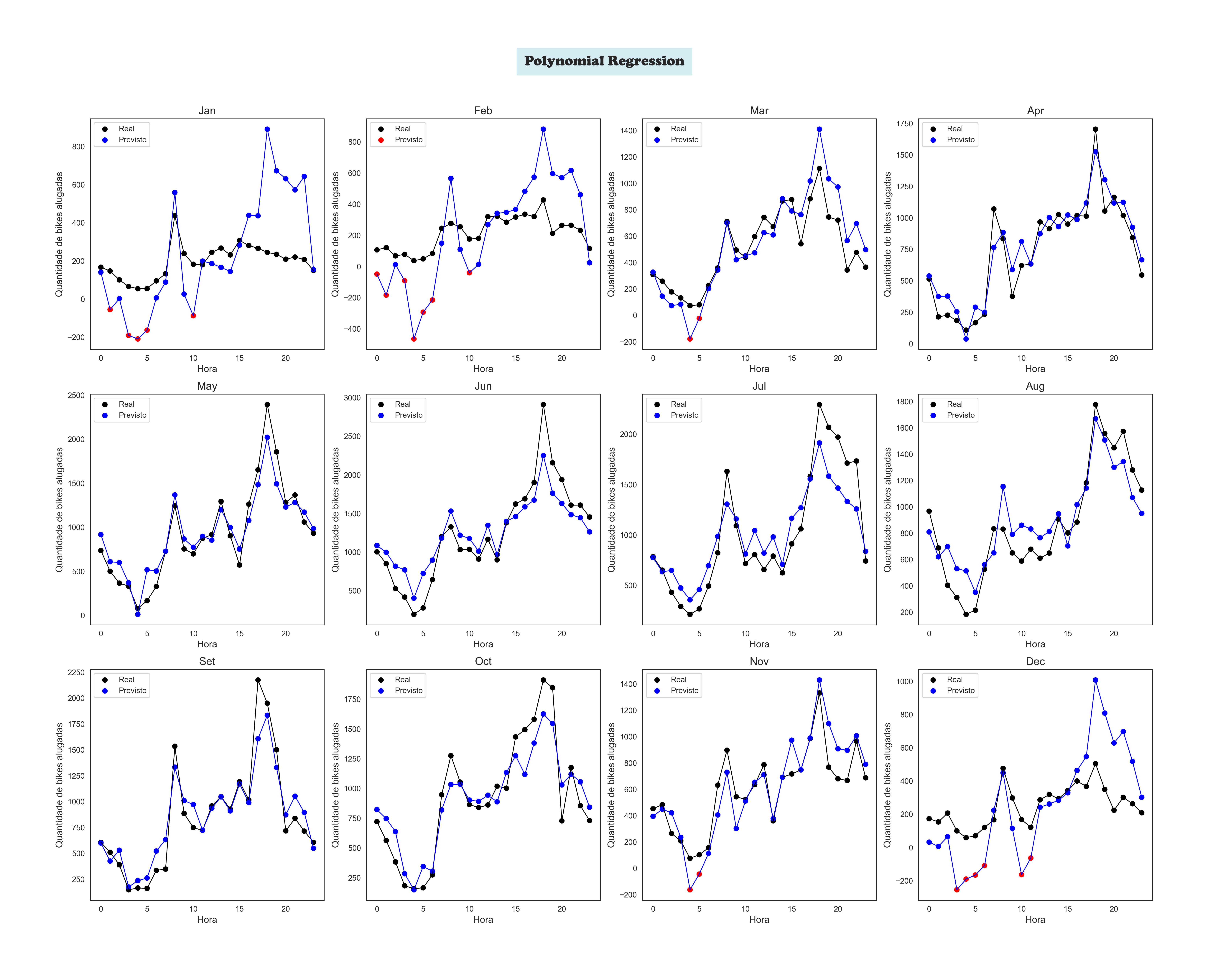
Polynomial Regression by Month
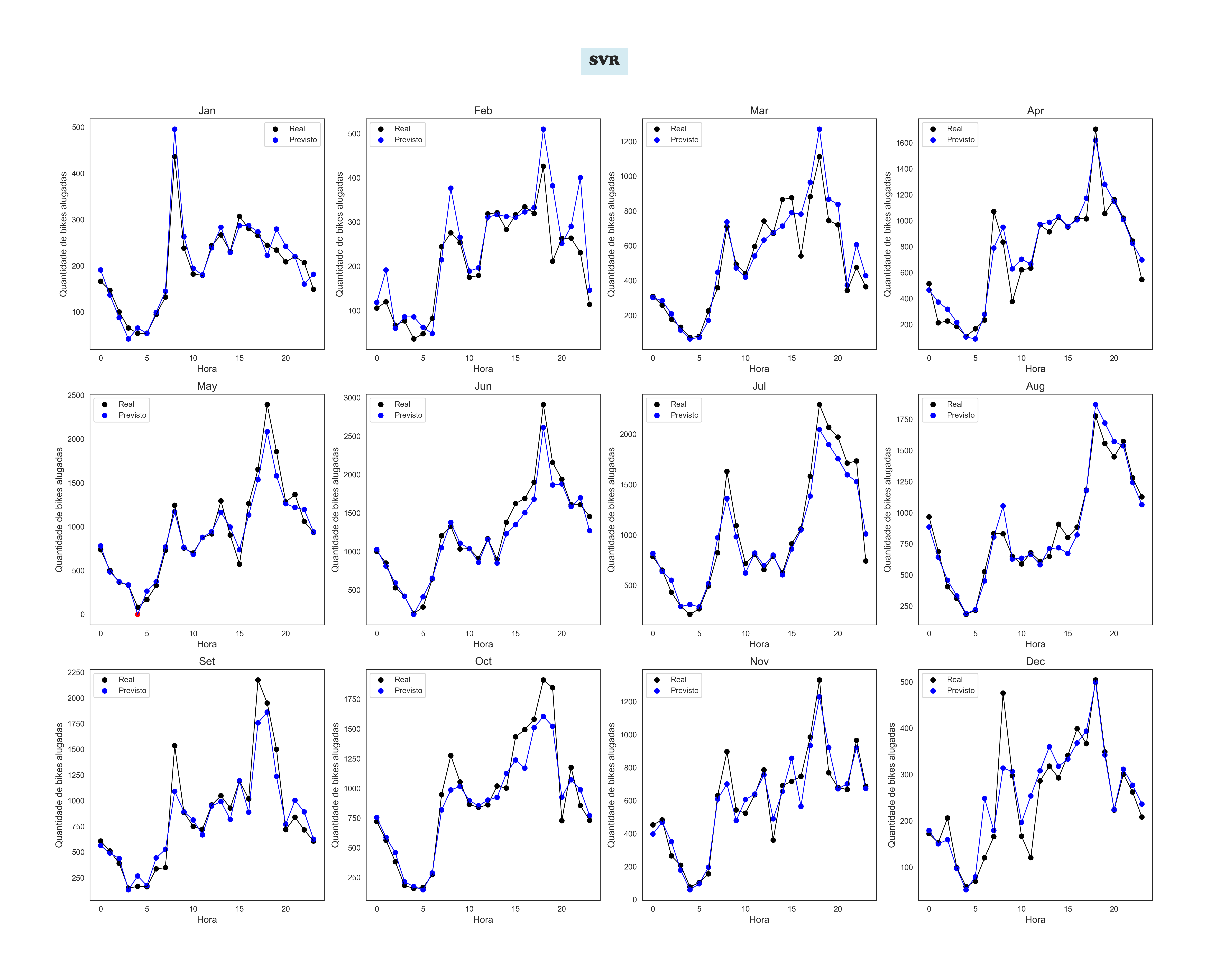
SVR by Month
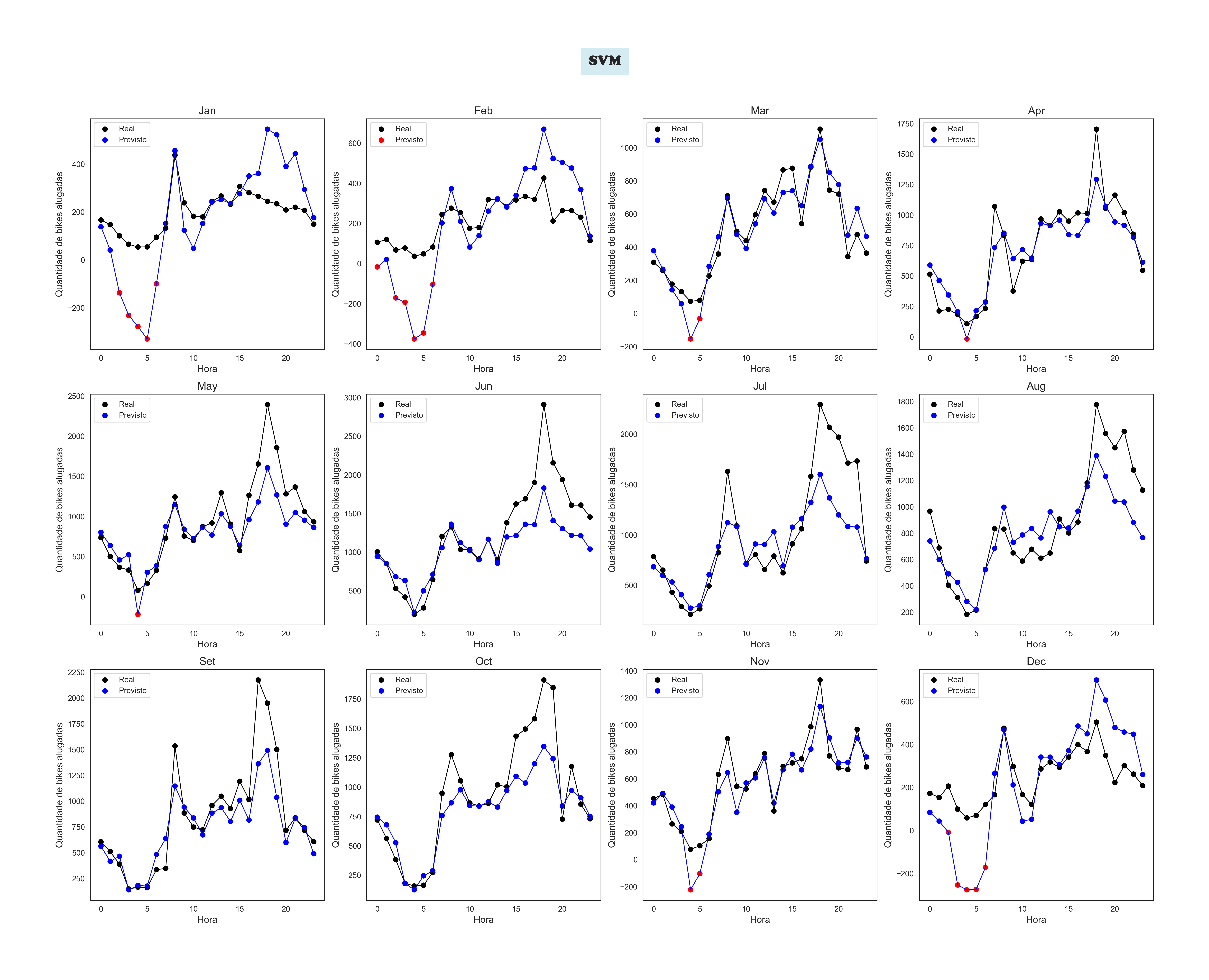
SVM by Month
A little introduction to show you the Web Application in action
To achieve this, I used Linear Regression. The user inputs data about the calendar, weather, and hour, and. The trained model processes this information to estimate the number of bikes available.
A Data-Driven Journey to Mastering Time Management
🧠 Case Study: A Data-Driven Journey to Mastering Time Management
How I Turned My Study Routine into a Personal Analytics Project Using Microsoft Fabric and Power BI
Background
During my postgraduate studies in Data Science, I found myself overwhelmed by complex subjects like mathematics and statistics. I realized that my biggest challenge wasn’t just the content—it was the way I was managing my time. I wasn’t studying efficiently, and I needed a smarter approach.
The Challenge
Like many learners, I struggled with distractions and an uneven study schedule. Traditional calendars and to-do lists weren’t cutting it. I wanted more than reminders—I wanted real insights into how I was spending my time and whether I was allocating it wisely across subjects.
The Solution
Applied Pomodoro and Timeboxing techniques to improve focus.
Retrieved calendar event data using Microsoft Graph API connected to my business account for secure access.
Processed the data using Python and PySpark in Microsoft Fabric Notebooks.
Organized the data into a medallion architecture with Bronze, Silver, and Gold layers.
Cleaned and transformed data with Power Query and built semantic models.
Queried the information with SQL Analytics Endpoint and visualized everything in Power BI dashboards.
What I Gained
A clear understanding of how I spent my study time.
Insight into where I faced the most doubts or needed extra help.
A reusable framework for tracking productivity and learning progress.
Hands-on mastery of Microsoft Fabric and Power BI, demonstrated in a real-world use case.
The Outcome
By transforming my personal challenge into a professional project, I not only optimized my study routine but also created a powerful portfolio piece. It’s a practical example of how data can improve everyday life—and how technology can support continuous learning.
🔧 Techniques Used
Data extraction using Microsoft Graph API
Data manipulation and transformation with Python, PySpark, and Power Query
Analysis with SQL and integration with Dataflow Gen2
🔐 Access to the TimeManagement Project
The TimeManagement Dashboard is a personal initiative focused on time management and study routine tracking, developed using Power BI, Microsoft Fabric, and Microsoft 365.
Because this project contains sensitive data and insights that reflect my personal journey, the repository remains private on GitHub. However, I’m open to sharing access with individuals who are genuinely interested in exploring the structure, visualizations, and solutions applied.
📩 If you’d like to view the project, feel free to reach out to me directly. I’ll be happy to generate a temporary access token with read-only permissions so you can explore the dashboard and related materials.
Access is granted selectively and securely, with the goal of preserving my privacy while encouraging meaningful exchanges with professionals, students, and enthusiasts in the field.
🎓 Video Series: Managing My Time with Microsoft Fabric & Power BI
This video series documents the technical journey I undertook to optimize my study schedule through data engineering and visualization tools. Each video highlights a unique stage of my process.
📘 Video 1: Retrieving Calendar Data with Microsoft Graph
I used Microsoft Graph and Graph Explorer to access calendar data from Outlook. Queries were refined using Postman, ensuring correct time zone settings. The results were saved as a JSON file and uploaded to a Lakehouse in Microsoft Fabric.
📘 Video 2: Data Organization and Layering in Microsoft Fabric
I introduced my data workspace and structured raw calendar data using Bronze, Silver, and Gold layers. I developed a function to clean and transform data, applied basic feature engineering, and converted a DataFrame to JSON for use in PySpark.
📘 Video 3: Structuring Data with PySpark
Defined a schema and created a PySpark table with key event data. Performed transformations and validated the dataset—then saved the output to the Silver layer and prepared it for enhancement in the Gold layer.
📘 Video 4: Data Extraction and Category Analysis
Extracted large datasets using a PySpark notebook. Created new columns and performed category-based analysis to uncover insights on time usage, calendar events, and data patterns.
📘 Video 5: Building Efficient Calendars for Study and Learning
Transitioned from a unified calendar to separate ones focused on studying and learning English. Uploaded JSON files, processed them using PySpark, and refined the setup with a clean, three-step method—later combining the tables in Power Query.
📘 Video 6: SQL Analysis and Power Query Deep Dive
Started with SQL analysis in Microsoft Fabric and moved into Power Query transformations. I selected relevant columns, generated new ones, and validated the transformation logic for calendar event data.
📘 Video 7: Advanced Transformations with Dataflow Gen2
Performed detailed transformations using Dataflow Gen2—changing column types, extracting strings, filtering rows, renaming fields, and building targeted datasets for Power BI dashboards.
📘 Video 8: Power BI + Microsoft Fabric Integration
Connected Power BI Desktop directly to my Lakehouse in Microsoft Fabric. Imported tables to begin analysis and created visualizations based on structured calendar and time usage data.
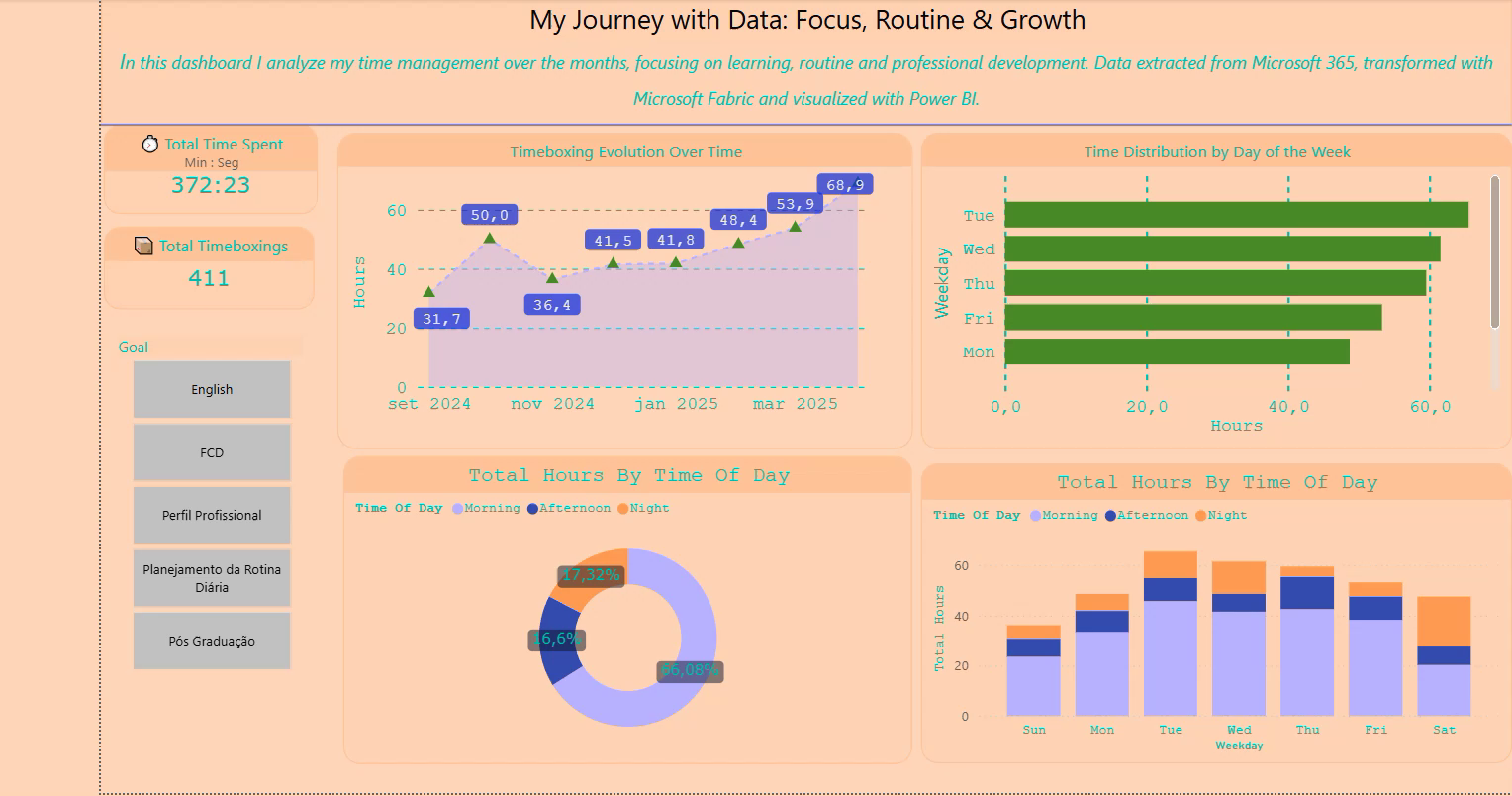
First page of my personal time management dashboard — built with Microsoft Fabric and Power BI
This project helps me track and optimize my study routines. Still in progress, with Planner integration and more data updates coming soon!
This notebook explores different ways to group data into meaningful clusters, helping to identify patterns and structure within complex information.
The goal is to find the most effective clustering model—one that balances accuracy, efficiency, and practical usability.
To achieve this, we tested several widely used approaches, including K-Means, Bisecting K-Means, and Gaussian Mixture models.
By comparing these methods, we aimed to understand which one performs best in organizing data meaningfully.
Throughout the analysis, we evaluated key indicators that measure how well the clusters are formed, such as the Silhouette Score and Davies-Bouldin Index.
Additionally, we assessed processing times to determine how efficiently PySpark handles clustering tasks.
All of this work was executed within Microsoft Fabric, a unified analytics platform that enabled scalable data processing and simplified orchestration of clustering experiments.
This notebook serves as a comprehensive overview of our findings, offering visual representations, comparisons, and insights into how these clustering techniques behave under different conditions.
Ultimately, the goal is to provide a clear understanding of the strengths and trade-offs of each model, supporting informed decisions when applying clustering to future challenges.
🚴 Real-Time Data Engineering with Microsoft Fabric – BikeTelemetry Project
In this project, I orchestrated a full-cycle real-time analytics pipeline for urban bike telemetry using Microsoft Fabric and KQL.
The initiative involved designing and implementing a robust event house to stream incoming data, refining ingestion strategies, and engineering transformations to ensure data quality and reliability.
🧩 Key Accomplishments
✅ Event House Configuration: Initiated a Fabric Eventstream to capture telemetry events from the urban bike system in real time.
🧠 Data Cleaning and Standardization: Engineered a transformation pipeline to fix inconsistencies in neighborhood naming using dynamic join logic.
🏠 Lakehouse Deployment: Established a Lakehouse to consolidate cleaned records and serve as a durable analytical store.
⏳ Temporal Gap Resolution: Investigated and resolved a hidden ingestion gap between manual append and policy activation, isolating and correcting a 366-record delta.
📊 Validation & Reconciliation: Implemented checks to confirm full sync between raw and cleaned datasets (Bikes vs BikesCleaned) — with zero data loss post-fix.
This hands-on project showcases my proficiency in real-time data flows, temporal diagnostics, and query optimization using KQL — alongside practical problem-solving in stream ingestion and lakehouse architecture.
📊 Bicycle EventStream Dashboard
This dashboard was created using data from the Bicycling EventStream sample available in
Microsoft Fabric. Although the dataset is simulated, it mirrors real-time behavior from actual
bike-sharing systems—making it ideal for testing ingestion flows, building dashboards, and writing
advanced KQL queries.
The dashboard is divided into two pages. In this first section, you'll find a breakdown of data records,
including ingestion volume over time, distribution by neighborhood, and detailed record patterns.
These visuals demonstrate how real-time data—whether simulated or live—can be transformed into
actionable insights for operational analysis and decision-making.
📘 Bicycle EventStream Dashboard part 1
🚲 Citywide Dock Status Analysis
In this second chapter of our Bicycle EventStream Dashboard, we shift our focus from ingestion volume to actionable patterns of behavior.
Powered by Microsoft Fabric and real-time streaming data, this section dives into how bike dock availability fluctuates across London — from quiet neighborhoods to mobility hotspots.
Using two dynamic visuals, we reveal the operational pressure points:
Visual 1: A citywide overview showing which dock stations are full or empty most frequently, offering a spatial lens on urban accessibility.
Visual 2: A detailed breakdown of bikepoints with the highest saturation and scarcity rates — highlighting the specific locations where intervention is most urgent.
These insights go beyond observation. They form the backbone for decisions in redistribution, station expansion, and fleet optimization — making the case for data as a frontline urban planning ally.
📘 Bicycle EventStream Dashboard part 2
Project information
Category: Real-Time Intelligence Eventstream with Microsoft Fabric
Technical proficiency across data science, programming, analytics and enterprise tools.
🔍 Programming & Data Science
Python 90%
SQL 75%
Machine Learning 60%
Exploratory Data Analysis & Forecasting 80%
Multivariate & Statistical Analysis 50%
Scikit-learn & ML Algorithms 60%
MongoDB 40%
C# with .NET 40%
R 30%
📊 BI, Cloud & Enterprise Tools
Power BI & DAX 70%
Looker Studio 40%
Microsoft Azure 60%
Microsoft Fabric 70%
Amazon SageMaker 40%
Databricks 60%
Docker & Kubernetes 40%
ETL & Feature Engineering 70%
Data Storytelling & Dashboarding 70%
SAP (FI / Localization) 80%
Git & Version Control 60%
Excel & Financial Modeling 80%
Education & Certifications
🎓 Academic Background
Postgraduate Diploma in Data Science (2024–2025) – DSA
Data Scientist 4.0 (2023–2025) – DSA
MBA in Governance in Tax Planning (2015–2017) – Infoco
Bachelor of Business Administration – Finance (2003–2007) – UMC
📜 Licenses & Certifications
SQL for Data Analysis and Data Science – DSA (2025)
Data Scientist 4.0 Course - DSA (2025)
AI Applied to Finance – DSA (2023)
Deploying ML Models – DSA (2023)
Cloud Computing for DS & AI – DSA (2022)
Programming and ML in C# e .Net Core – DSA, Agu.2022
Cloud Computing for DS and AI – DSA, Jul.2022
Advanced Power BI for Data Analysis – DSA, Jun.2021
Cloud Storage and Processing with Microsoft Azure – DSA, Oct.2021
MongoDB for Python – MongoDB University (2021)
Genetic Algorithms – Udemy (2021)
SAP FI Academy – Ka Solution (2011)
Experiences
Professional Experience
Python Developer & Data Analyst
Dec 2021 - May 2023
Xcelis, Remote
Agile methodologies
Working with CLEAN Code
Automated tests, CI/CD pipelines
Unit testing, integration testing
Building visualizations with PowerBI and DAX and M Language
Troubleshooting
Working with remote team
Python Developer
2020 - 2021
RThomaz Tecnologia de Dados MEI, Sao Paulo, SP
Worked as a freelancer in my own company.
Employed Python, pandas, and C# for data munging and dashboard creation.
Developed Power BI dashboards.
Employed Python, pandas, Matplotlib, and Seaborn to construct charts.
Applied Scikit-learn to construct Machine Learning Models.
Utilized standard database tools such as SQL in Microsoft SSMS.
Applied Genetic Algorithms.
Data Analyst
2020 - 2021
Project: Price of Wheat Commodity around the world , Sao Paulo, SP
Analyzed global time series data encompassing temperature, precipitation, and worldwide wheat production, exportation, and importation.
Leveraged a suite of data analysis and visualization tools, including Python libraries (pandas, numpy, matplotlib, chardet), Jupyter Notebook, Colab, and Power BI, to conduct in-depth data analysis and create impactful visualizations.
Recommendations
“Renata participated with me in an award-winning data science project in the Data Science Academy 2021 data science mentoring program. An excellent professional, dedicated, committed to results, and always seeking knowledge!”

.jpg)